

PPL wanted to enhance the user experience and usability of its contract placement platform, particularly in response to user dissatisfaction with the current channel.
PPL wanted to enhance the user experience and usability of its contract placement platform, particularly in response to user dissatisfaction with the current channel.
PPL's primary objective is to offer the market a platform that enhances productivity. The recently updated platform aims to empower underwriters and brokers to navigate the intricacies of placements through collaborative tools.
However, initial feedback from users has been negative. In response to user dissatisfaction with the current platform, PPL wanted us to enhance the user experience and usability.
100% increase on customer satisfaction
4/5 customer satisfaction score, up from 2/5
Goals
Show the market, stakeholders and investors that PPL is listening and reacting to negative feedback.
Stem the bleed of customers to competitors by understanding what brokers and carriers want from the platform.
Create a proof of concept prototype and set of design principles that would allow the product and dev teams to redevelop the platform.
Solution

We conducted thorough research on the PPL platform, which culminated in the development of a forward-thinking prototype. This prototype, coupled with UX and UI design recommendations, illustrates substantial enhancements to platform usability.
Our research revealed that 95% of brokers predominantly create single contract placements, with only 5% engaging in multi-placement contracts. The existing PPL platform, designed to accommodate both types of contracts equally, has resulted in a convoluted system for all users. Consequently, brokers experience a significant increase in time and effort in their workflow.
We devised a new design tailored to the distinct needs of each user group. Comparative testing of the two platforms demonstrates the considerable improvements achievable through the new design.
Final report: 4 key usability issues were presented alongside a set of UX/UI design principles on how to resolve them .
Navigation framework
Issue: The navigation framework was considered over complicated, clunky, not always clear what the user was meant to do next. Too many clicks meant tasks could take much more time and concentration than users had the patience for.
Solution: We simplified the navigation structure to make it more intuitive, learnable and memorable for all user abilities, and requires less training.
2. Webforms
Issue: Much of what users are doing on the PPL platform is form-filling. However this can be time consuming and the the platform is not very forgiving if you make mistakes.
Solution: We introduced simple, standard form etiquette to expidite the process and make them more user friendly e.g. marking mandatory fields,
3. Managing tasks
Issue: Brokers and carriers want managing tasks to be simpler. They find it difficult to find, identify and organise tasks for themselves or their teams.Mapping out the user flows using a ChatBot simulator.
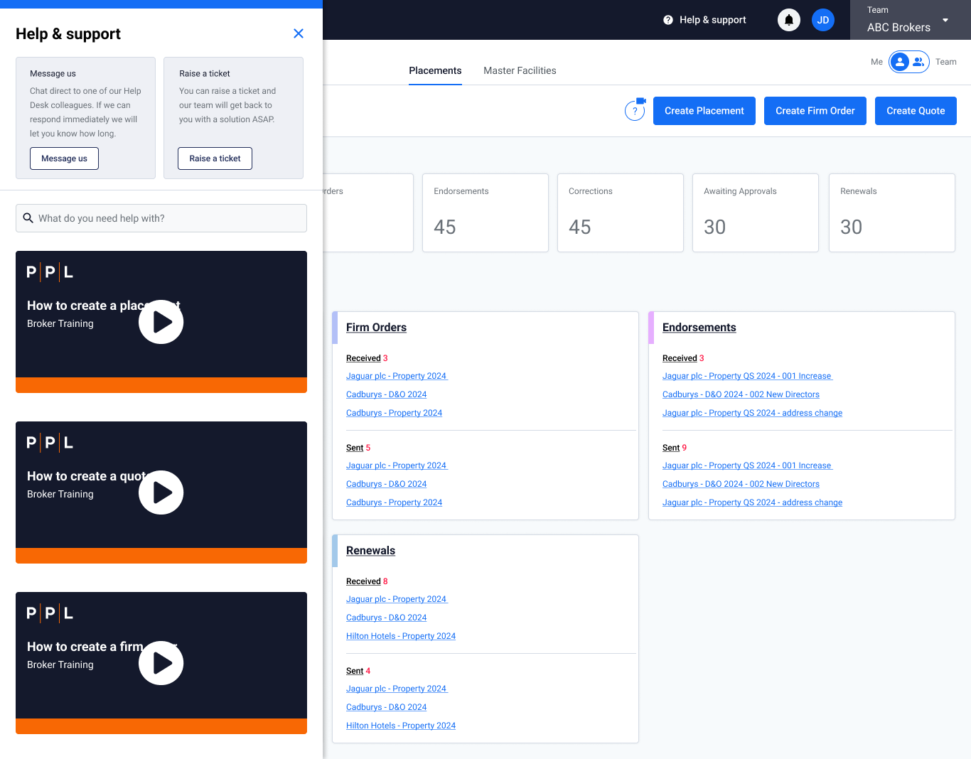
Solution: We introduced new dashboard screens that helps users to see the latest tasks that require their attention of that they have recently completed.
4. Training and help
Issue: Brokers and carriers want a platform that requires less reliance on training. Currently it can take up to 1.5 hours for training which is on a on a separate platform. Some users are not engaging with the training or forget it at the point of need.
Solution: To make the platform could be more intuitive and supportive we introduced in line contextual help to enable user sto ‘learn as they go’.
“You’ve taken it to the other side of the ocean. The new navigation and interface is a vast improvement.”
“Giant steps forward. You’ve taken the best bits from Next Gen and V3 and combined into a modern interface. Everything I’d want from a platform”
“This will be a game changer for PPL”


