

EDF wanted to improve its Help Centre to meet the needs of a variety of different user groups, from those looking to troubleshoot common problems, to those requiring support with their services.
EDF wanted to improve its Help Centre to meet the needs of a variety of different user groups, from those looking to troubleshoot common problems, to those requiring support with their services.
Customers accessing the help and support pages to search for information do so with varying success, resulting in some customers contacting EDF instead of self-serving.
This leads to a reduced customer experience and increased traffic into our contact centres costing EDF nearly £1m a year. Improving the Help Centre provided a large opportunity to change customer behaviour, prevent some of this contact and reduce costs.
74% decrease in contact from customers following engagement with Help Centre
156% increase in customers successfully completing a self-serve transactions
269% increase in customers rating finding articles useful
Goals
The current EDF search function performs poorly and we believe that by offering a more robust search function we can ensure customers with more edge case problems can get to a solution quicker.
Moving to a troubleshooter triage function for high volume, low-medium complexity issues seen across the year, with a reduced number of steps, will give customers a more effective way to self serve.
Promoting that customers sign in to their MyAccount at appropriate points will mean we can offer them contextual help within the MyAccount area of the site - and also personalised content when using the Help Centre.
Solution

Guiding UX principles
We agreed a set of UX principles to guide our design approach:
Frictionless - ensuring short, meaningful, personal journeys to help support
Solutions & actions orientated - helping customers solve problems, not just learn about them
Specific to ‘me’ focused - specific personal advice for customers within MyAccount
Proactive - predicting problems and offering contextual solutions
Always up-skilling customers - showing how best to manage our services to avoid problems
We mapped out how we will incrementally bring our vision to fruition through a series of activities, and explores the technologies we will use and the principles each activity meets.
Prominent search
Search was not being adopted as a key entry point, which is probably due to its positioning.
We repositioned the keyword search field near the top of the main landing page and allowed customers to search in their own words for the solutions they are looking for. This will give reassurance that they are on a strong path to success.
We offer features such as autocomplete or drop-downs of suggested search terms.
Clear entry points to categories based on intent/ common queries
Categories that, when logged in, reflect entry points based on the customers service profile
Search is now powered by AI and able to interpret intent from the varied ways in which customers may ask for support.
The search will continuously improve as it learns more about what customers are looking for and the best solutions.
Simple triage system
The old triage use made up a significant portion of help journeys (38% of sessions) but has a success rate of only 31%.
We simplified the triage flows to allow customers to easily troubleshoot common problems or questions via a simple triage flow – which gives clear solutions or suggested actions to resolve issues that will up-skill our customers to help them to manage their services moving forward.
Questions sets that are easy to select from based on the action the customer wants to perform
Pictures or icons to help signpost customers make the right selections
An answer presented at the end of the triage steps
Short, simple text
Videos and imagery to support customers understanding of more complex topics
Clear next actions to take if the solution isn't useful
Example 1
Example 2
ChatBot
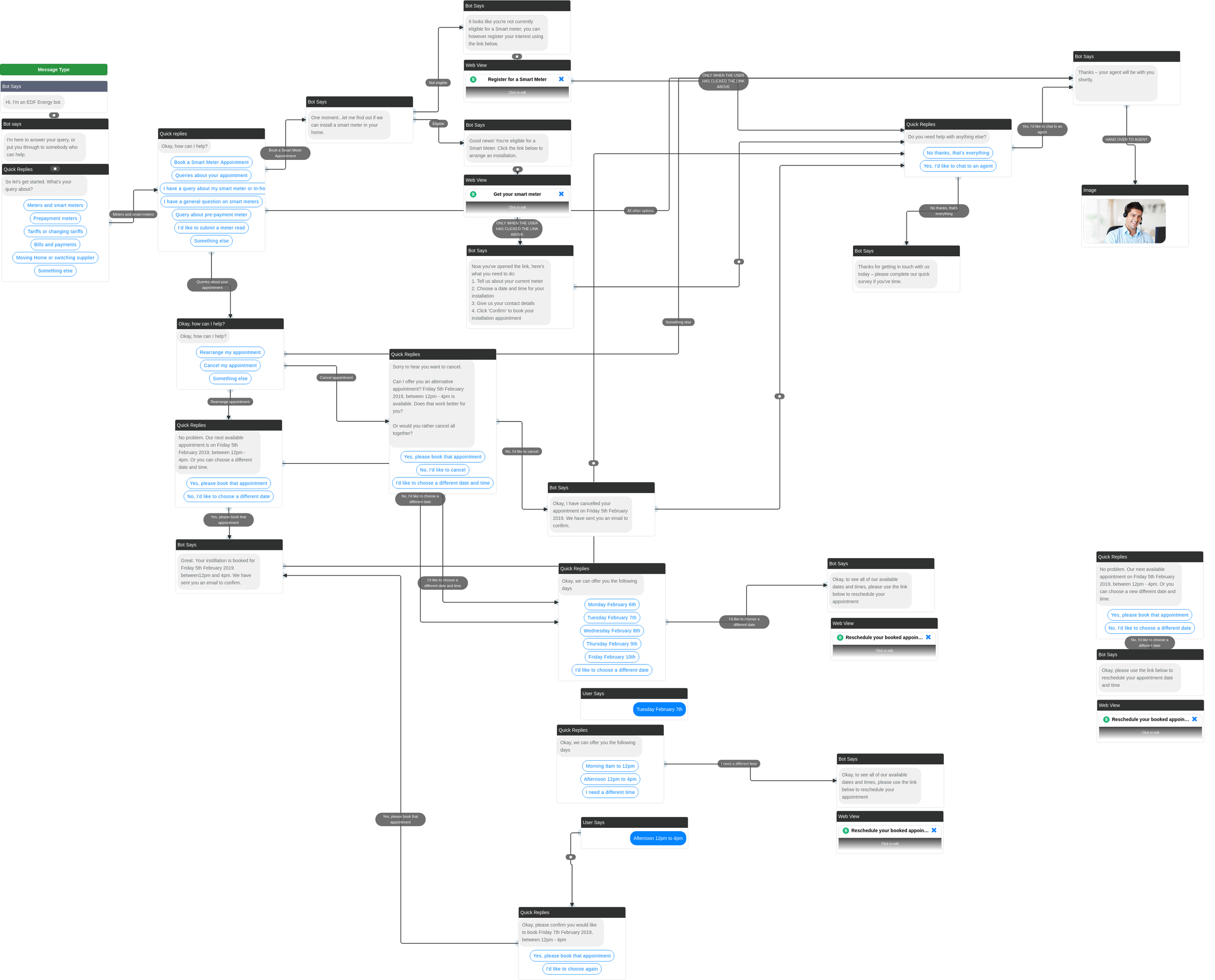
Mapping out the user flows using a ChatBot simulator.
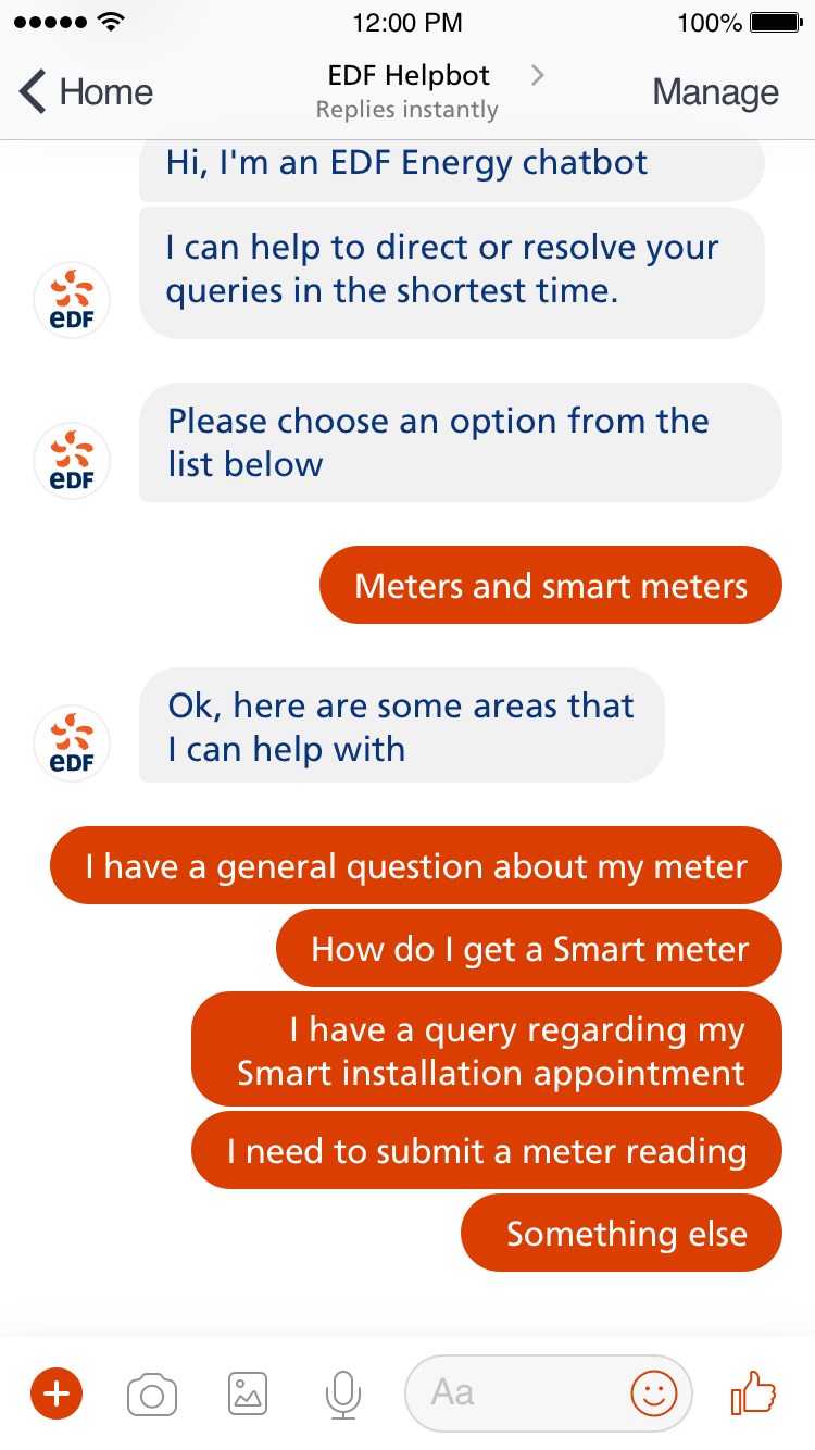
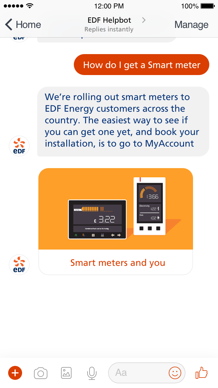
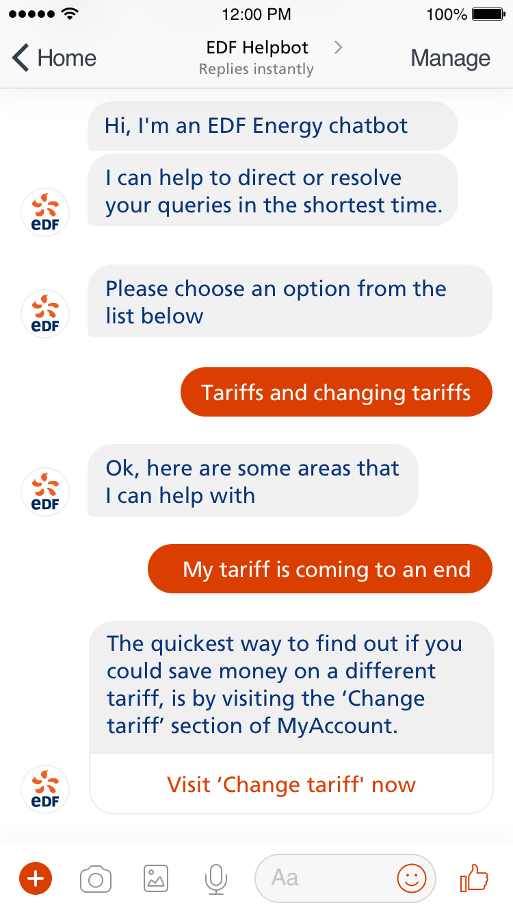
Designing the user interface to reflect the different responses and next actions.


